Amazon
Wedding Registry
UX/Visual Design
Amazon Wedding Registry lets you shop the world’s largest selection to find everything you need to build your new life together.
From conception to completion, I was part of the design sprint which includes researching, developing storyboards, wireframing, prototyping, and visual design, as well as pitching and presenting design solutions to stakeholders and leadership.

Challenge & goal
Amazon Wedding is one of the most considered registries. The program has an unremarkable conversion rate and high home page abandonment rate. Research revealed most registries are created during a user’s first visit to the Wedding experience, which typically occurs on the home page, making the first impression of the site crucial to convert more considering couples.
The current home page is static, lacks guidance, and compelling reasons for visitors to explore more. The redesign allows us to address the foundational work needed to achieve operational excellence while offering users inspirational, relevant content, and customization.
What if we designed a new experience so that it gives our customers an impressionable, relevant registry journey?
The wedding experience lacks in the creative bar set by Amazon and its competitors. IT also lacks clear messaging to push users to the relevant next step in their journey. The goal was to redesign the experience with a clear hierarchy, and clearing out the “clutter” to create a more digestible and intuitive customer experience.
I started a competitive analysis and researched industry leading wedding registry sites such as Zola and the Knot to understand how these sites work and to define any UX patterns. Most of these sites start with a hero image, followed by an explanation of their top benefits, then customized articles related to wedding planning.
I quickly created a few paper wireframe sketches on paper. After a few iterations our team decided that this version made the most sense to balance design updates with business needs.
From then, I created low-fidelity wireframes in Sketch. I also showed the 3 zones and labeled them here so that stakeholders can easily digest the visual heirarchy.
Here is the style guide that was created. We are using a mix of 2 fonts, Bookerly and Amazon Ember. The main accent color was chosen to bring a bright pop to the experience. We created a wedding-focused line iconography library.
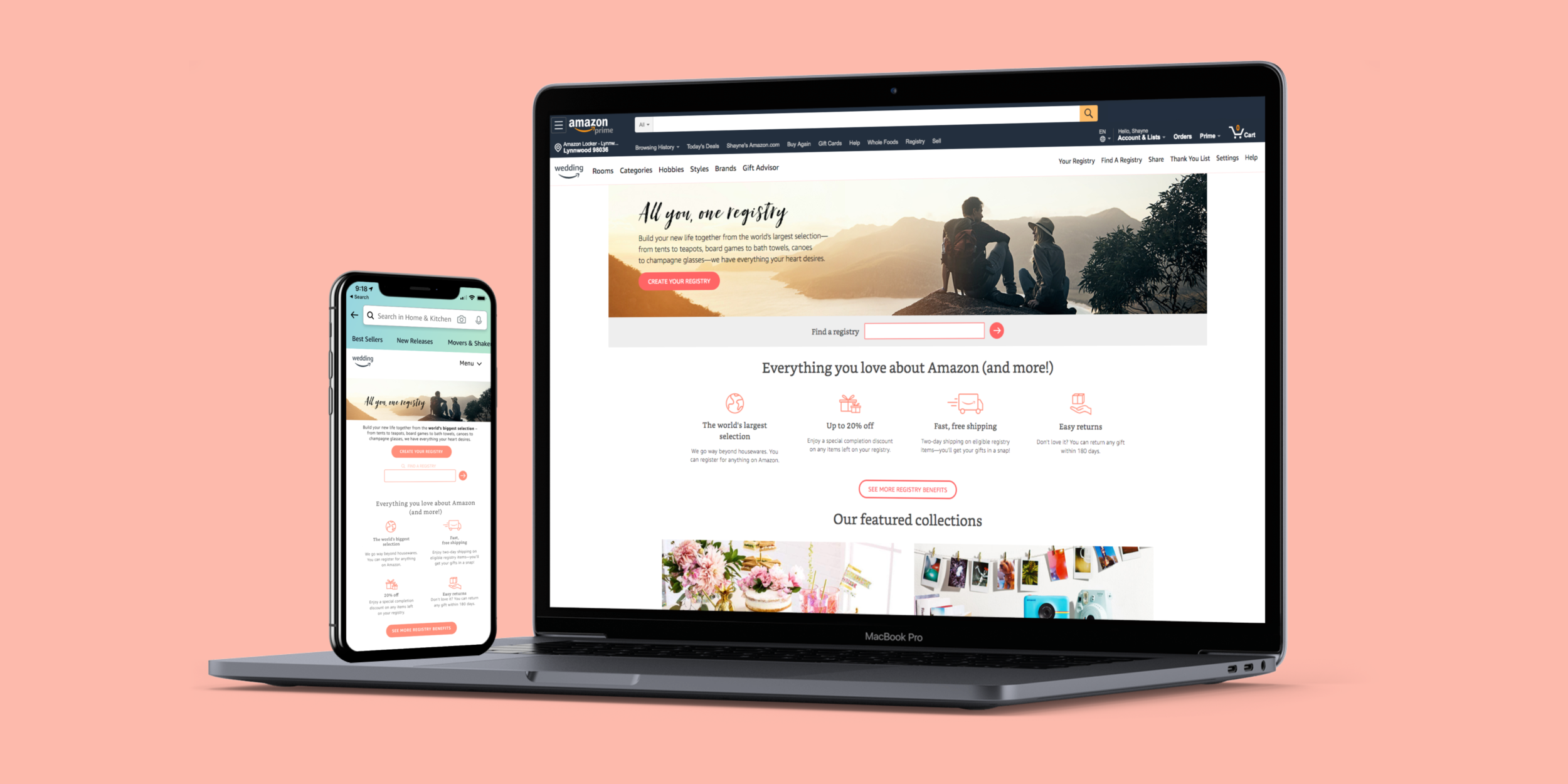
Here is the final design incorporating the style guide and photography provided by the art director.


